01Context
LinkedIn Dark Mode
Seeing things in a different light
Bringing dark mode to LinkedIn’s 900+ million members
A more comfortable LinkedIn experience
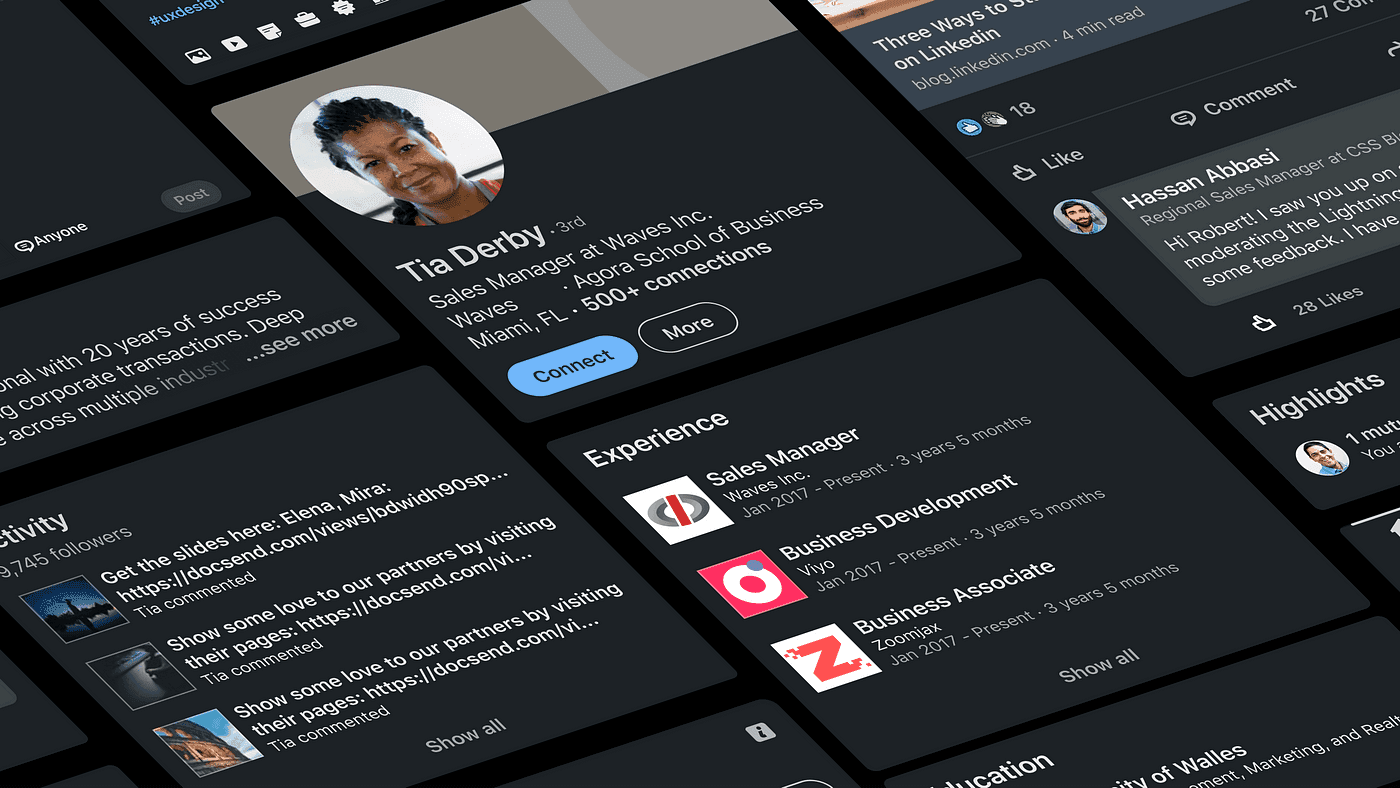
Building on our design refresh—crafted to reflect LinkedIn’s diverse, warm, and welcoming community—Dark Mode was the next step in making the platform more adaptable to members’ needs. More than just a visual update, it reduced eye strain, improved accessibility, and gave users greater control over their experience. Rolling it out at scale required a thoughtful balance of design consistency, accessibility, and seamless integration across a platform used by millions daily.

Leading dark mode from vision to launch
I led the vision, strategy, and execution of Dark Mode for LinkedIn’s consumer app, working closely with product, engineering, and accessibility teams to ensure a smooth rollout. With over 10,000 color usages to rethink, we redefined contrast ratios, color semantics, and brand integrity across both light and dark settings. Every decision had to balance aesthetics with functionality, ensuring a cohesive and polished experience across the platform.

Designing for accessibility and usability
Dark Mode had to be more than just a color shift—it needed to enhance usability. We refined color palettes for optimal contrast, reduced glare in low-light settings, and ensured interactive elements remained intuitive. Every design choice reinforced comfort, readability, and accessibility.
Beyond colors, we fine-tuned motion, depth, and interactive states to create a smooth, fatigue-free experience. This was also an opportunity to expand our illustration system into Dark Mode, designing visuals that complemented the darker aesthetic while maintaining warmth and inclusivity. The result was a Dark Mode experience that felt polished, natural, and seamlessly integrated with LinkedIn’s broader design principles.

How members reacted to dark mode
Dark Mode was one of LinkedIn’s most requested features, and its launch was met with overwhelming enthusiasm. Many members actively sought early access, with some even following support articles to join the rollout as soon as possible. App Store reviews quickly reflected excitement—Dark Mode became one of the most mentioned and praised features, driving a surge in positive feedback about LinkedIn’s UI. This response underscored the demand for more personalization and accessibility-driven improvements across the platform.

Key takeaways & lessons learned
This project reinforced the importance of accessibility, collaboration, and attention to detail in large-scale UI changes. Designing for millions of users required thoughtful decisions that benefited everyone, not just those who opted in.
By prioritizing accessibility and iterating based on feedback, we delivered a feature that enhanced usability while setting the foundation for future personalization on LinkedIn. More than just a visual update, Dark Mode was a major UX transformation that made LinkedIn more customizable, accessible, and user-friendly for millions worldwide.