Too Much to Afford
And making buttons look tappable is cheap
Sep 22, 2013

Most likely, in just a couple of days, iOS 7’s release date will be announced. I have mixed feeling about the design direction of iOS 7 for much of what I describe as a lack of affordance (more on this later). The other big concern is the icons aren’t consistently helpful either. They’re not consistent and not all great, and they aren’t consistently great. But you have to admit it’s a bold new direction for Apple, and while some will say Apple is arriving late to the party, as usual, others will say it’s about fashion (which a bunch of it is). So it’s hard to argue that it won’t be new and different. And I bet in a few months; we will wonder how the hell we even got along with the old look of iOS.
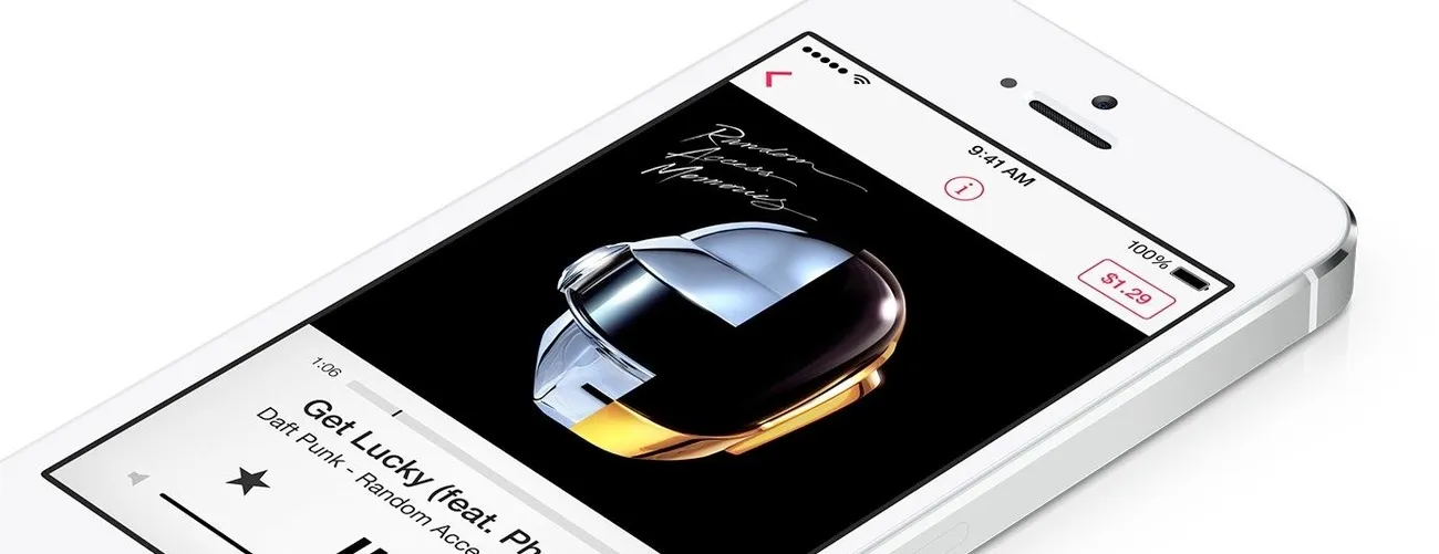
So Apple is joining the party that Google and Microsoft have been in for over the past year. What’s new with Apple arriving late to the scene with fresh takes on old ideas? We’ve seen this play out time and time again. Many people get infuriated by this, and others see it as Apple’s innate way to take their time and disrupt things on their terms. Windows Phone and Window 8 have some new/good design thinking. You could argue it really pushed Apple to consider their design approach sooner for where iOS 7 was going. But I condemn both Microsoft and Apple for going too far and throwing affordance out the window. I know we’re all tired of glossy, button-y buttons, but give us something to distinguish between labels, text, and tappable buttons. User experiences can be clean, fresh, and minimal while being obvious and inviting. Just a thin round rectangle around the label would be perfectly acceptable. Apple is doing this in some small areas like iTunes Radio to buy a song, but their early guidelines for iOS 7 direct developers and designers to just use text. This guidance is just ridiculous. I hope with follow-up releases, they see the error of their ways and bring back some discreet level of affordance.
User experiences can be clean, fresh, and minimal while being obvious and inviting.
I had the opportunity to try out a Microsoft Surface. The experience simply isn’t good. I grew frustrated with it in under a minute as I attempted to log in and open the browser. Again, no affordance and hiding everything as learned gestures makes for a very frustrated user. It seems as though everyone is really swinging the pendulum way too far the other way. I’m hoping it’ll even out sooner or later. Either Apple, Google, and Microsoft will figure this out and remedy the situation, or we will all learn to live with it and tap any bit of text that we think is tappable.
So what’s up with OS X then? Well, rumor has it Mac OS X Mavericks (10.9) will ship this October. It has slight hints of the design direction of iOS 7. Things like new apps (iBooks, Maps) have simplified, cleaner icon designs and older apps that took the skeuomorphism thing too far now have it way dialed back. But I think the team is in this “one thing at a time” mode, and iOS is definitely their crown jewel and design sandbox in many respects. So I think we’ll get along with Mavericks for a year, and then we’ll see a lot of iOS 7 design direction show up in the new release. Let’s just hope Apple has figured out the right amount of affordance by then, which has got to be more than none.

